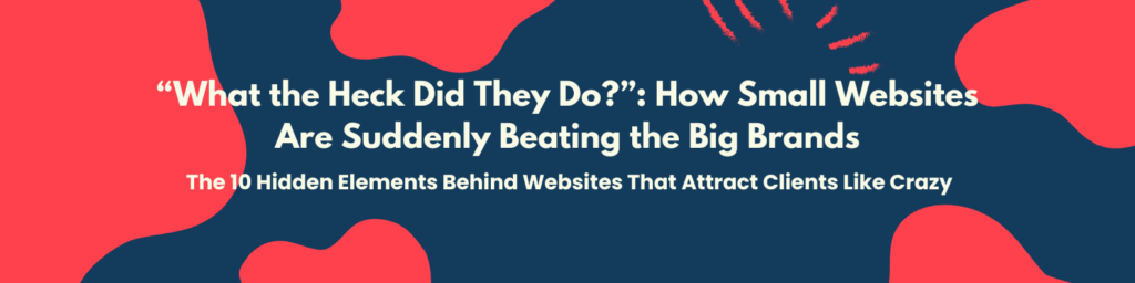
The 11 Hidden Elements Behind Websites That Attract Clients Like Crazy
For the past 2 years, I was studying websites of successful businesses — from small freelancers to big brands like Apple, ClickFunnels, and Airbnb.
And something shocked me.
It wasn’t their logos. It wasn’t their fancy designs. It was how simple their websites were — yet they turned visitors into clients like magic.
Meanwhile, other business sites (that looked just as good) got… crickets.
That’s when I realized: It’s not about having a website. It’s about having a website that converts.
Then I started to connect the dots.
I noticed the same principles I learned from my coaches and the courses I enrolled in — the ones about psychology, funnels, and persuasive copywriting — were right there in those high-performing websites.
It finally made sense.
The secret formula isn’t hidden in some expensive program. It’s built around 11 simple ‘hidden’ elements that anyone — yes, even small business owners — can apply today.
If you start using these, your competitors will be asking the same thing people say when they see a shocking Netflix twist:
“What the heck did they do?!” 😳
Let’s break it down.
1. Clear Value Proposition (Above the Fold)
Imagine walking into a store. You see products everywhere… but no signs, no prices, no idea what they sell. Would you stay?
That’s how most websites are built — confusing.
In the first 5 seconds, visitors should instantly know:
- Who you help
- What you offer
- Why it matters
💡 Example:
“We build websites that bring you clients — not crickets.”
It’s clear, bold, and focused on results. Your website’s first line should sell clarity, not mystery.
When people “get it” fast, they stay longer — and that’s where conversions begin.
2. Strong, Benefit-Driven Headline
Your headline is the first thing they read — and it decides if they’ll scroll or leave.
Think of it like a Netflix trailer. You have 5 seconds to make them go, “Hmm… tell me more.”
❌ “Welcome to My Website”
✅ “Get a Website That Attracts and Converts Clients Automatically.”
The second one answers your reader’s biggest question:
“What’s in it for me?”
As Russell Brunson says, “Sell the result, not the process.” Because people don’t buy “web design.” They buy growth, clients, and confidence.
3. Emotional Story or Hook
Every great Netflix series starts with a story. Your website should too.
Share how you started, what problem you saw, and how you help people overcome it. Don’t hide the pain — use it to build connection.
Example:
“Two years ago, I built my first website. It looked amazing… But no one booked a call. No sales. Just silence. I thought design was everything — until I learned what makes websites actually convert.”
Stories make people feel seen. Emotion opens hearts. Logic only comes after.
4. Strategic Call-to-Actions (CTAs)
Ever noticed how Netflix never lets you wonder what to do next? After one episode — “Next Episode Starts in 5 Seconds.”
That’s how your website should feel. Every page should guide your visitors to take action.
✅ “Book a Free Strategy Call”
✅ “Get a Free Website Audit”
✅ “Download Your Free Guide”
Don’t be shy about repeating it. Clarity creates confidence. Confidence creates clicks.
5. Social Proof & Trust Signals
Before people buy, they think,
“Can I trust this person?”
And the best way to answer that is proof.
Show real testimonials. Add client logos. Include case studies and certifications.
When visitors see others succeed with you, they feel safe saying yes.
It’s like checking reviews before watching a new show. If thousands of people loved it, you’re more likely to hit play. Same rule online — trust converts faster than design.
6. Mobile-First Design
Here’s a fact: over 60% of web traffic now comes from phones.
That means most people see your site through a 6-inch screen.
If your site looks broken or hard to read on mobile, you’re losing clients before they even scroll.
A mobile-friendly site is like Netflix on your phone — same story, same quality, just built to fit your screen.
So test everything on mobile first. If it doesn’t look great there, fix it. Because a “desktop-only” website is a modern business killer.
7. Fast Load Speed
Time is money — literally.
A 1-second delay can drop your conversions by 7%. That means if your site makes $10,000 a month… you could lose $700 for every second it slows down.
That’s painful.
Optimize your images. Use a faster host. Avoid heavy animations that look “cool” but kill your speed.
People today won’t wait — not when your competitor’s site loads faster. Speed isn’t just technical — it’s psychological trust.
8. Simple Navigation & Clear Flow
Ever watched a confusing show and thought, “Wait… who’s that character again?”
That’s how a cluttered website feels.
Every section should guide people naturally — from interest to action. Each button, headline, and paragraph should lead to the next step.
Think of your site as a funnel, not a maze. Simple wins. Always.
When your visitor never gets lost, they never leave.
9. Persuasive Copywriting
Design catches the eye. But words close the deal.
Write like you’re talking to one person — your dream client.
Instead of:
 “We offer innovative digital solutions.”
Try:
 “We help business owners turn their websites into client-getting machines.”
Use short, punchy lines. Highlight benefits. Sell the transformation — not the tools.
Your words should move emotions and build belief. Because a well-written sentence can do what a thousand ads can’t.
10. Lead Capture System
Not everyone buys on their first visit. So don’t let them leave without staying connected.
Offer something valuable: 📘 Free guide 🎥 Free training 🧮 Free audit
You’re not “selling.” You’re starting a relationship.
Just like Netflix says,
“Add to Watchlist.”
They know you might not watch today — but they’ll make sure you come back.
That’s how you turn visitors into lifelong leads.
11. The Persuasive Promise
Here’s your closing scene — the moment that sticks.
Your visitors shouldn’t just see your website. They should feel hope.
Example:
“Your dream clients are out there. Let’s build the website that brings them home.”
That’s the final bridge between logic and emotion. It tells your audience: this isn’t just a service — it’s your next chapter.
So that’s it.
After comparing hundreds of business websites, I saw one truth: Small businesses are now outsmarting big brands — simply because they learned to connect, not just impress.
A good website doesn’t need to be flashy. It just needs to be clear, emotional, and human.
And once you apply these 11 elements, don’t be surprised when your competitors visit your site, pause… and whisper to themselves:
“What the heck did they do?” 😳
Because that’s what happens when your website finally works. Not just as a design — but as a growth engine.
I’ve studied what makes websites convert — from the pros, the courses, and the real-world results. Now it’s your turn.
Message me and get a Free Website Audit. Let’s find the simple tweaks that can help your business attract more clients — without spending a dime on ads.